Finance is the function that gets the most value from Power BI when it is done well, and the most frustration when it is not. The reporting demands are constant, the audit trail matters, and the audience ranges from a board pack on Monday morning to a cost centre owner trying to understand their overspend on Friday afternoon. Power BI can serve all of that, but only if the underlying model is built like a finance person would build it, not like a generic BI demo.
Why finance teams reach for Power BI
Most UK finance teams arrive at Power BI from one of two directions. Either the monthly management pack has grown into a forty tab Excel workbook that takes three days to refresh and falls over when someone breaks a link, or the FD has been asked for self service reporting and decided the answer is not another bespoke report request queue. Both are reasonable reasons. Power BI fits because it can model the chart of accounts properly, refresh from the ERP automatically, and give cost centre owners their own view without anyone in finance having to email them a tab.
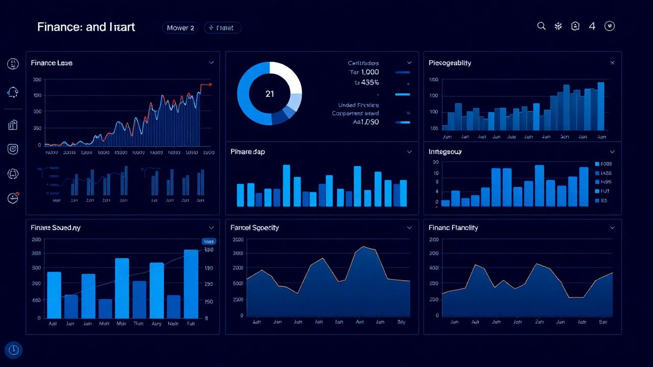
What a working finance dashboard looks like
A useful finance dashboard in Power BI is almost always made up of four or five focused pages, not one giant overview. Typical pages we build:
- P&L summary — actual, budget, prior year and variance, with the ability to drill from group down to department and then to transaction.
- Cashflow and working capital — debtor days, creditor days, stock days and a rolling 13 week cash view.
- Revenue analysis — by product, customer and channel, with margin overlaid so the gross margin story is visible, not just the top line.
- Cost centre detail — one page per cost centre owner, filtered by their login, so they can see their own spend without seeing everyone else's.
- Month end pack — the formal report the FD takes to the board, exported to PDF on the same data the interactive pages use.
Modelling the chart of accounts properly
The single thing that separates a finance dashboard that lasts from one that collapses after six months is how the chart of accounts is modelled. Power BI needs a clean star schema with a proper account dimension, mappings to management reporting categories, and a calendar that understands your financial year. Cramming the GL into a single flat table and writing DAX around it works for the first demo and breaks the moment someone restructures a cost centre.
Time intelligence is the other half of the picture. Variance to budget, prior year comparisons, year to date, rolling twelve months — all of this should come from the model, not from twenty near identical measures pasted into the report. Done once, properly, this layer carries the team for years.
Budgeting, forecasting and write back
Power BI on its own is a read tool. For budgets and forecasts you still need a place for finance to type numbers in. The usual pattern is a structured Excel template or a planning tool (Anaplan, Vena, or a lightweight SQL based input app) that feeds the same warehouse Power BI reads from. The board sees one number, finance still owns the input process, and nobody is pasting budget figures into a Power BI page.
Self service for cost centre owners
Row level security in Power BI is what makes the cost centre page work. Each manager logs in and sees only their own area, with the same definitions and the same numbers finance is using. This single feature removes more "can you send me the numbers" emails than any other change we make.
The pitfalls we see most often
Three recurring mistakes. First, building the dashboard from the extract finance already uses for Excel, rather than modelling the source data properly. The technical debt catches up within a quarter. Second, trying to put every possible analysis on one page — finance dashboards are not operational dashboards and should not look like one. Third, treating Power BI as a finance only tool. The chart of accounts, customer master and product master modelled for finance is the same data sales and operations should be using; build it once.
Getting started
For most finance teams the right first project is the monthly management pack — replace the worst Excel workbook in the building with a proper Power BI model and a clean set of pages. From there, cashflow, revenue and cost centre views usually follow within a quarter. If you would like help scoping the first release, our Power BI consultancy and dashboard design pages explain how we work.
Frequently asked questions
Is Power BI useful for finance teams?
Yes — finance is one of the strongest fits because reporting demands are constant and the chart of accounts maps cleanly to a Power BI model. The main caveat is that the underlying data model needs to be built properly; a quick Excel import does not scale.
Can Power BI replace our Excel month end pack?
For the reporting and analysis layer, almost always yes. For the input side — journals, accruals, budget entry — you still need Excel or a dedicated planning tool feeding the same warehouse.
How long does a first finance dashboard usually take?
Four to eight weeks for a first release covering P&L and variance to budget, assuming ERP data is accessible. Cashflow and cost centre self service tend to follow in the next phase.
Want to talk this through with someone?
We are an independent UK Power BI and Microsoft Fabric consultancy. Honest opinions, fair prices, no sales pressure.