
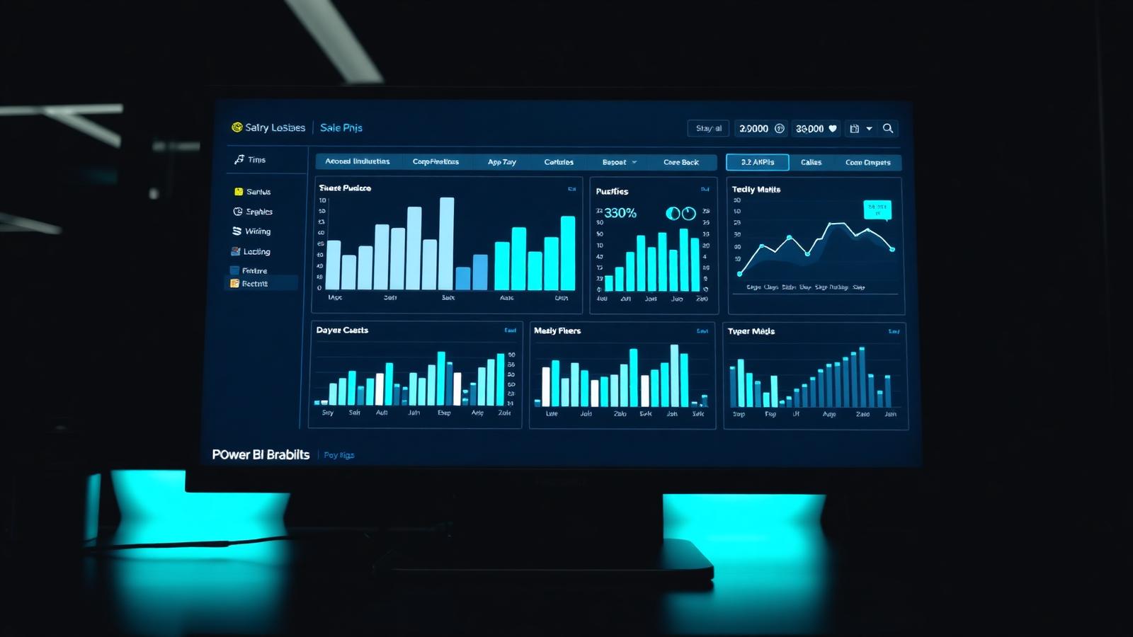
A Power BI dashboard is one of those things that looks simple from the outside. Drag a few visuals onto a canvas, wire them to a dataset, publish. Anyone can produce something that renders. The gap between that and a Power BI dashboard people actually rely on is enormous, and it has almost nothing to do with the tool. It comes down to the data model underneath, the questions the page is trying to answer, and a handful of design decisions most first time authors get wrong.
Start with the decision, not the data
The most common mistake we see when reviewing a Power BI dashboard is that it was built around what data was available rather than what someone needs to decide. Every good dashboard starts with a sentence: who is opening this, on what schedule, and what will they do differently as a result. If you cannot answer that in one line, the dashboard is not ready to build.
A sales director looking at pipeline on a Monday morning wants to know which deals are slipping and where to spend time. A finance controller closing the month wants to see variances to budget with a clean drill path to the ledger. An operations manager on the shop floor wants the current shift, not the year to date summary. Same platform, same data, three completely different pages.
The data model is the dashboard
The single biggest determinant of whether a Power BI dashboard performs is the model, not the visuals. Star schema with a clean fact table and dimensions for date, product, customer and geography will run circles around a flat table stitched together in Power Query. Every DAX measure gets simpler, every slicer gets faster, and future changes stop cascading through every report.
If the underlying data is messy, the dashboard will be too. Invest an extra day on the model early on and you save weeks of firefighting later. This is the point at which many teams bring in outside help; we cover the shape of that engagement in our UK Power BI consultancy guide.
Layout: one page, one story
Power BI dashboards work best when each page answers a single question. Users scan top to bottom, left to right. Put the headline number in the top left, the supporting trend to the right of it, and detail below. Not every page needs a KPI card row; if the story is a trend, lead with the trend.
Resist the urge to cram. A page with twelve visuals is almost always worse than the same information split across two pages with a clear navigation. Users forgive a click; they do not forgive a page they cannot understand at a glance.
Colour is a language, not decoration
Colour in a Power BI dashboard should mean something. Red for below target, green for on or above, grey for neutral, one accent for the brand. If every chart uses a different palette the eye has nowhere to land. Keep the theme file simple, use it consistently across every report in the workspace, and test the whole thing in dark mode and on a projector before signing off.
Interactivity earns its place
Slicers, drillthrough and cross filtering are the parts of Power BI that separate it from a static PDF. Used well they turn a dashboard into a conversation. Used badly they turn it into a puzzle. A few rules that tend to hold up:
- One primary slicer per page. Anything more usually signals a page that is trying to do two jobs.
- Cross filter direction should be set explicitly on the model, not left as a default.
- Drillthrough pages should be discoverable. Add a small tooltip visual reminding users the right click exists.
- If a filter changes the meaning of a KPI card, show the filter context on the card itself.
Common pitfalls
We review a lot of Power BI dashboards and the same handful of issues come up again and again. Bidirectional relationships used casually, quietly wrecking totals. Measures written as calculated columns, blowing up refresh times. Row level security tacked on at the end as an afterthought. Sixteen colours on a single visual. And the classic: a live connection to a transactional system that falls over at month end.
None of these are hard to fix. They are hard to fix once the dashboard is embedded in someone's Monday morning routine and they have shared it with the board. Ship the first version smaller than you think you should, then extend.
Publishing and governance
A Power BI dashboard is only useful if the right people can find it and trust it. That means a sensible workspace structure, a clear promotion path from development to production, and endorsement labels so users know which datasets are certified. Governance is boring; ignoring it is expensive.
For teams outside the biggest enterprises, three workspaces usually suffices: a sandbox for exploration, a shared development workspace, and a production workspace that is read only for most users. Add a deployment pipeline once you outgrow that.
Examples by function
The pattern above holds for every function; what changes is the metric set. A finance dashboard leads with variance to budget and cash. A sales dashboard leads with pipeline coverage and win rate. An operations dashboard leads with service level and utilisation. HR leads with headcount and attrition. If you are unsure what a Power BI dashboard for your function should look like, our Power BI for finance and Power BI for HR guides walk through concrete metric sets and layouts.
Where to start
Pick one decision, one audience, one page. Build the model properly. Ship it, watch someone use it, refine. Repeat. A collection of well built single page dashboards will beat a single monster report every time. If you would like a second opinion on what to build first, our Power BI consultancy page explains how we run short discovery engagements.
Frequently asked questions
How long should a Power BI dashboard take to build?
A well scoped single page dashboard on a clean data source usually takes one to two weeks end to end, including discovery, model, build and one round of feedback. If it is taking a lot longer, the scope has drifted or the underlying data is not ready.
How many pages should a Power BI report have?
Fewer than you think. Three to five pages, each with a clear job, is a good target. Beyond that, users stop navigating and start ignoring pages.
Should Power BI dashboards use live connection or import mode?
Import mode is the default for a reason. It is faster, more forgiving and does not put load on the source system. Reach for DirectQuery when the data volumes or freshness requirements genuinely justify it, and expect to spend more time on tuning.
Want to talk this through with someone?
We are an independent UK Power BI and Microsoft Fabric consultancy. Honest opinions, fair prices, no sales pressure.