
Data Visualisation Services
Charts that tell the story in three seconds or less.
Data visualisation services for UK businesses that want their reports and dashboards to actually communicate. We choose the right chart, apply a calm visual system and make sure the answer lands before anyone has to think about it.
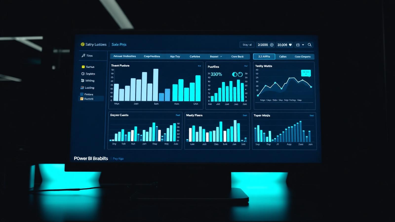
Most reports do not fail because the data is wrong. They fail because the audience cannot read them quickly enough to care. A pie chart with fourteen slices, a dashboard laid out like a fruit machine, thirty different shades of blue, tiny numbers on a grey background. All of that is a design problem, not a data problem.
Our data visualisation services fix the design layer. We start with the question the audience is trying to answer, choose the chart that answers it fastest, and lay the page out so the eye lands on the right thing first. It sounds obvious. Very few reports we inherit have done it.
The visual system we apply is deliberately calm. Off white or off black backgrounds, a small palette of accent colours reserved for the numbers that matter, generous whitespace, sensible typography. That approach works whether the audience is a board member on an iPad or a warehouse supervisor on a mounted screen.
What we bring
Visualisation done properly, end to end.
Right chart, right question
Bar charts for comparisons, line charts for time, dot plots for distribution, small multiples for segmentation. Nothing decorative. Everything earns its place.
Visual system
A single palette per client, applied consistently. Accent colours held back for the values that actually need attention. No rainbow dashboards.
Page layout
Clear visual hierarchy on every page. Headline number top left, supporting detail below, filters where they belong. Reads well on a phone or a boardroom TV.
Accessibility
Colour blind safe palettes, readable font sizes, sufficient contrast. Meets WCAG AA where it matters, and looks better as a side effect.
Interactive stories
Drill through, tooltips and bookmarks used sparingly to let the user answer their next question without leaving the page.
Rebuilds and refreshes
Take an existing report that everyone has quietly stopped opening and turn it into something they will use again. Often the fastest win we can offer.
Where we usually start
A visual redesign is often the fastest win.
If you already have Power BI in production but the reports are not being used, a data visualisation service is usually the right first step. It is faster and cheaper than replatforming, and it forces the hard conversations about what each report is actually for.
We can rework an existing report in a week or two. From there, we often move on to a broader visual system so every future report your team builds looks and feels like part of the same product.
Common outputs
- Redesigned Power BI report pages
- A written visual style guide for your team
- A Power BI theme file matched to your brand
- Custom chart layouts and templates
- Accessibility review and remediation
- Board and executive summary pages
- Operational wallboards for shared screens
Get started
Ready for reports people actually read?
Send us a screenshot of a report that is not working. We will come back with a short honest view on whether visualisation, modelling or something else is the real fix.